2014/01/13
in
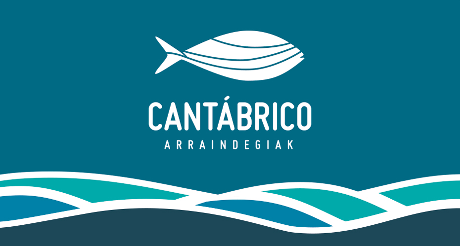
Cantábrico Fishmongers
Project title: A fresh look | Client: Cantábrico Fishmongers | Date: 2013 We have recently completed the visual corporate identity for “Cantábrico arraindegiak”, a new fishmongers that has opened in Durango. The objective was to connect the sea and fish concepts, achieved in the logo marque by uniting the colours of the sea, waves and the emblematic tuna. In addition to the logotype, we also worked on the interior design of the shop, incorporating waves into the decoration as well as a large mural that shows old Basque fishermen of Bermeo at work. (images to follow). The new identity has been applied across other brand elements including uniforms, packaging and business stationery. ...
Continue Reading